Read the Room, Then the Edit: Picking Leicester Wedding Flowers for Your Photographer’s Style
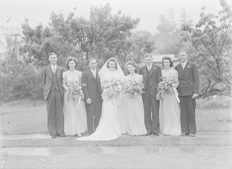
Photo: Collins, Tudor Washington, 1898-1970, photographer, CC BY 4.0, via Wikimedia Commons
Most couples choose a flower palette by standing in a venue, squinting at a swatch, and asking whether peach really goes with the bridesmaids. Fair enough. But there is another set of eyes on your flowers all day: your photographer’s camera, and the editing style that follows it. The same dusky burgundy dahlias can look rich and velvety in one gallery and slightly muddy in another. The same crisp white roses can feel clean and bright or creamy and warm. None of that is a reason to panic. It is a reason to have a quick, sensible conversation before you finalise the bouquet, buttonholes and table flowers.
Start with the end picture
Wedding photography is not a neutral record. Every photographer makes choices about warmth, contrast, colour and grain. Some lean golden and romantic. Some keep things light, airy and clean. Others go moody, film-inspired and deep. Those choices are part of the look you booked, so it makes sense to choose flowers that work with that look rather than against it.
This is not about designing your wedding for Instagram. It is about knowing that strong magenta, acid green, deep red and pale blue can all behave differently once an edit is applied. A good photographer will happily tell you what tends to happen to certain shades in their work. A good florist will tell you what is in season, what holds up, and what might be a risk in a particular venue. You are the bridge between those two conversations.
Warm and golden: lean into honey, peach and bronze
A warm edit tends to make creams look creamier, greens look more olive, and reds look a little more brick than pillar-box. That can be gorgeous with flowers that already have a bit of heat in them: ivory garden roses, peach ranunculus, apricot dahlias, caramel antirrhinum, bronze chrysanthemums, rust-coloured helenium and olive-toned foliage. Add in soft brown seed heads or a few tawny stems and the whole thing feels like it was made for late afternoon light.
Where it can wobble is with very cool whites and very blue-based purples. In a warm edit they can tip towards grey or cream, which is fine if you expected it and less fine if you wanted a crisp, icy look. Bright fuchsia can also become very hot indeed. If you love a warm gallery, tell your florist you want stems with a bit of depth and texture rather than flat, electric colour.
Bright and airy: keep contrast gentle and whites clean
Bright, airy photography usually lifts shadows, softens contrast and keeps whites looking white. That suits a palette of ivory, blush, pale butter yellow, soft blue delphinium, lilac and plenty of fresh green. Texture matters here: ruffled lisianthus, cosmos, astilbe, sweet peas, waxflower and fine grasses give the camera something to catch without turning into a heavy dark shape.
Shades that can feel too weighty in this style include deep burgundy, navy, aubergine and very dark purple. They do not disappear, but they can read almost black against a light, airy scene. Strong red can also dominate more than you expect. Acid green is another one to watch; in a very bright edit it can look almost neon. If you want a bold colour, use it as a small accent rather than the main event, and ask your photographer how they handle saturated tones.
Moody and film-inspired: choose depth, not mud
Moody, film-inspired galleries often love depth: burgundy, plum, chocolate cosmos, deep red roses, aubergine calla lilies, dark trailing amaranthus, berries and magnolia leaves. These flowers have somewhere for the shadows to live. They look rich and dramatic in a venue with low light, and they can feel wonderfully grown-up without being gloomy.
Labels such as ‘muddy’ get used a lot, but what people usually mean is that a colour has lost its clarity. Deep reds and purples are the ones to test carefully. A crimson rose can go brownish in a cool, desaturated edit. A pale pink can turn grey. A bright white can glow so much that it distracts. If you are going moody, lean into flowers with natural variation and texture rather than flat, synthetic-looking colour.
The shades that cause the most arguments
There are a few usual suspects. Bright magenta and fuchsia can turn unnaturally hot. Acid green can go neon or sickly. Strong orange can overwhelm a soft palette. Deep red can go muddy in cool edits. Blue hydrangea can shift towards mauve. Pure white can blow out in bright light. None of these are banned. They are simply shades to mention to your photographer and florist rather than assume will behave.
It also helps to remember that flowers are not paint charts. A garden rose has layers, shadows and a bit of variation. That is a good thing. A bouquet made entirely of one flat, saturated colour is harder to photograph well than a mix with some tonal contrast.
A quick note on Leicester venues and light
Leicester weddings happen in a wonderful mix of places: churches with stained glass and cool stone, village halls with tungsten bulbs, hotels with mixed lighting, marquees with whatever the sky decides, and registry offices with bright windows. Warm edits plus tungsten light can go very golden. Bright, airy edits plus a grey day can need a bit more flash or reflection than couples realise. Moody edits can struggle in a very bright conservatory unless the photographer is deliberately embracing contrast.
This is why it is worth showing your photographer the venue, or at least a few photos of the room, before you settle on a palette. Ask your florist how the flowers will look under the venue’s lights, not just in the shop. Then ask your photographer how they usually handle that sort of light.
Questions to ask before you commit
- How would you describe your editing style in plain English?
- Can I see a full gallery from a similar venue, season and light situation?
- How do you handle whites, deep reds, purples and bright pinks?
- Do you use flash during the day, and how does that change flower colours?
- Can I send you my palette or moodboard before I confirm it with my florist?
- Are there any flower colours you have found difficult to edit consistently?
- How much editing is included, and do you provide a mix of colour and black-and-white images?
The bottom line
Choose flowers you actually love. You should not spend your wedding day looking at a bouquet and thinking about colour grading. But do check that your photographer’s style and your flower palette are singing from the same hymn sheet. A five-minute conversation about warm whites, deep reds and bright greens can save a lot of second-guessing later. Your flowers have to work in the room and in the gallery. Get both right and the photos will feel like the day you remember, not a version of it that has been quietly filtered into something else.